


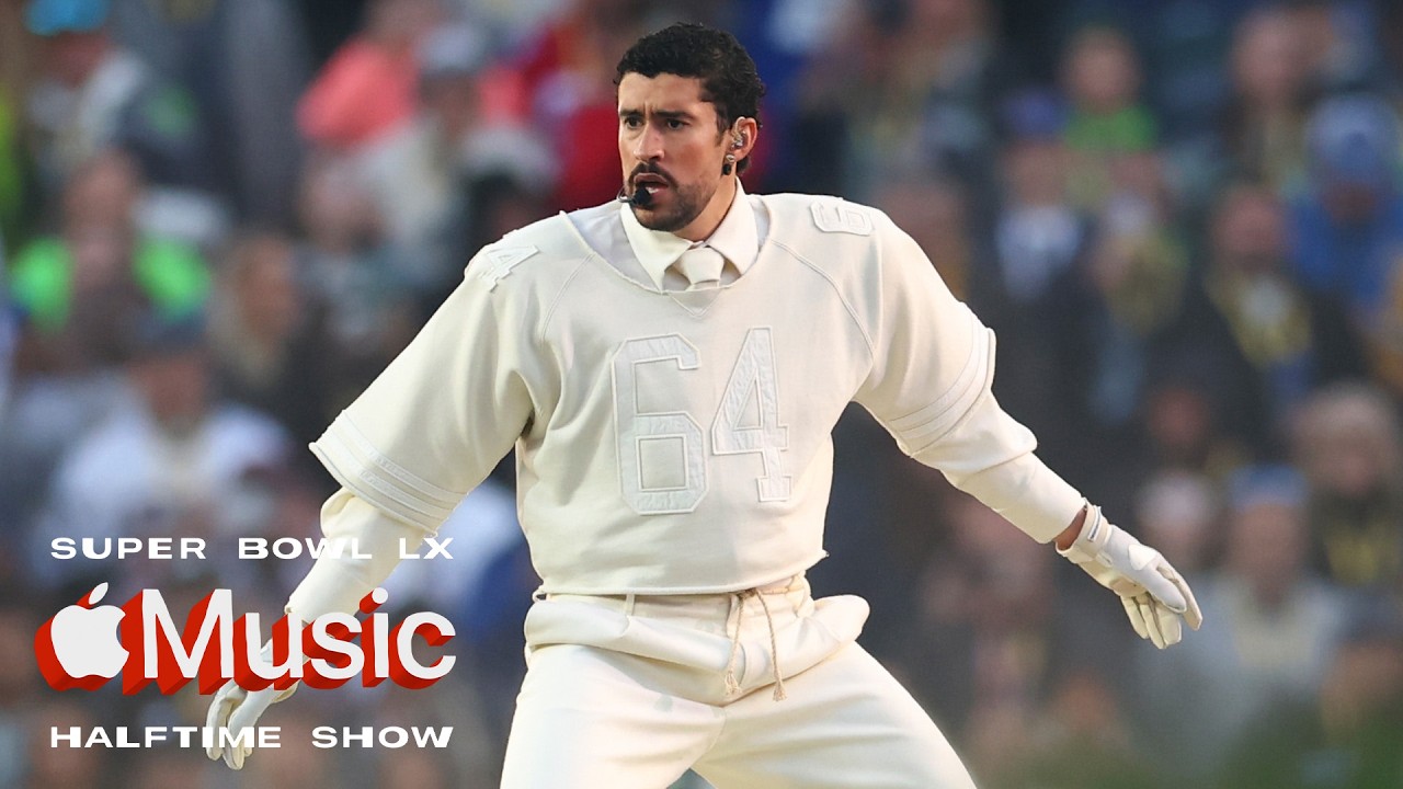
While some have already moved on to deciphering the secrets of the Super Bowl 2027 logo, a lot of people are still talking about Bad Bunny’s incredible Super Bowl half-time show on Sunday. The 13-minute performance during New England Patriots vs Seattle Seahawks felt like a cultural milestone and a brave gesture of resistance given what’s been happening in the US (also see how artists are responding to ICE).
The ‘King of Latin Trap’ performed entirely in Spanish, Ricky Martin begged Puerto Rico not to let the US “do what they did to Hawaii”, and the show ended with a cry of “God bless America” – America being defined as “Chile, Argentina, Uruguay, Paraguay…” and the other countries that make up the continent.
A photographer’s post took off on Threads when he asked the question on many people’s minds. “Colorists, what emulation / grade is this? Reminds me of Cineprint and/or Kodak? It looked INCREDIBLE.”
Others agreed with his verdict. “The wedding dance section gave me inspo of the Godfather wedding scene. The colouring was top tier,” one person wrote.
The question led to plenty of speculation. Some suggested Danny Gervitz’s Filmy LUTs were at work, others guessed Kodak vision 250D or a “Kodak neg under a 2383 print underexposed by a half a stop or so”.
The mid tones look red or pinkish while lows lean green and highlights towards a yellow-orange. The grade chimes with the tone the show was going for as an nostalgic but celebratory tribute to Puerto Rican history and culture and the neighbourhood where Benito Antonio Martínez Ocasio grew up in Vega Baja.
The post gained so much traction that Adam Lighterman, the colourist and Live Cinema Multicam specialist who worked on the show, saw it and responded. And while he didn’t exactly share his node tree, he at least provided a hint of what he wanted to go for with the look and feel of the grade, revealing that the show LUT was inspired by Cullen Kelly’s Genesis and Contour.
“I don’t want to go into specifics but let’s just say I’m a huge fan of Cullen Kelly’s tools Genesis and Contour. There is always a little bit of secret sauce too. I was given some references from the creative director and a general feel and matched that as best I could with the production design and lighting,” Adam wrote.
Another colourist recommended that anyone looking to emulate the feel concentrate on identifying what they see rather than looking for a specific LUT.
“They just used a custom show LUT based on what the set design and lighting was like,” they note. “The same Film Print Emulation can look a million different ways despite overall similarities between the stock so if you’re discussing looks and trying to figure out what’s going on, I recommend talking through WHAT you see with the colors and how the set is designed rather than focusing on / naming a LUT.”
This has to be the first time I’ve seen a Super Bowl half-time show spark a discussion about colour grading. That’s a probably a sign of this colourist’s skill, but it also shows how much more aware people are these days of the role colour grading plays in creating the atmosphere of a production, and they notice when attention’s been given to it.
For an introduction to the basics see our features on colour theory and what is colour grading?


