


Warner Bros debuted a new Animation logo at Annecy this week as part of its slate for 2026-2028. The new design echoes traditional hand painted animation in its simplicity – and the addition of Tweety Pie flying next to the logo tops off that stylistic decision.
The logo retains the iconic WB plate (one of the best logos ever, undoubtedly), but in a flat design that steps away from the textured finish previously seen in this logo format. The ‘animation’ tag has moved underneath the logo, and sits in a simple script font that echoes the flat design of the logo plate. It’s a nice antidote to CGI saturation.
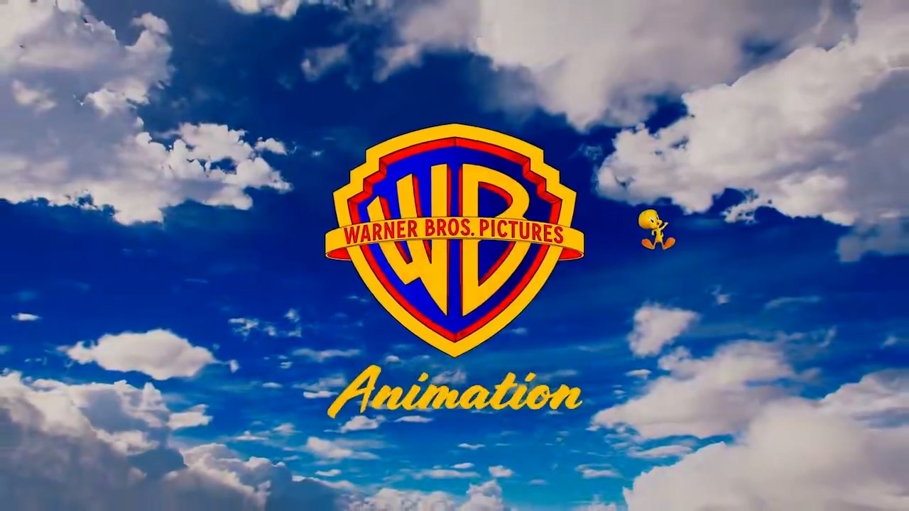
The logo was introduced as part of a delightful opening animation that features the well known water tower changing colour and hues throughout. The old gold shiny logo briefly shows at the end, before turning into the new matte version. The whole reveal is a celebration of the animation process, beginning with a hand drawn sketch that is slowly filled with colour.
See the logo evolution below:
Fans love the logo already. “That’s fire. I love the flat color in the WB logo. Keeps it cartoony,” one says on Instagram. And the nod to Disney’s Tinkerbell is clear to many. “Tweety is perfect as warner Tinkerbell. it’s the perfect irreverent symbol that spells Warner,” says one comment.
Warner Bros Animation slate promises projects including Tom & Jerry, Thunder Cats, Meercats and The Cat in the Hat in the next couple of years. Lots of cats, then.


