

Everyone’s seen the original Nintendo logo, reflecting its history as a manufacturer of playing cards, but some are still surprised to learn about the history of Sega. The
Believe it or not, the maker of Sonic the Hedgehog didn’t intentionally name itself after an Italian slang word for a hand job. The brand name is actually a simple portmanteau of the company’s previous name.

While Sega’s now best known as one of the big Japanese game companies, its history goes back to a merger between American Standard Games and Service Games of Japan in the 1950s – a long time before Sonic appeared on the scene.
Founded by US businessmen Martin Bromley and Richard Stewart, Service Games of Japan’s business involved providing slot machines to US bases in Japan. The partners later founded Nihon Goraku Bussan in 1960, adding jukeboxes to their product lineup. In 1965, they merged with Rosen Enterprises and renamed the company as Sega Enterprises, abbreviating the name Service Games. The first logo was very different to the iconic blue futuristic wordmark we know today.

The first Sega logo has tall bold sans serif letters with diagonally cut tops giving the design a fantasy novel kind of vibe.
The company had success developing its own arcade games in 1966 with Periscope and in 1969 was bought by Gulf and Western Industries (then the owner of Paramount Pictures). It continued to run the arcade game business through the 1970s.
It adopted the logo we know today (top image) in 1975, using the Yagi Double font also seen in the CNN logo. Initially used in black, blue was adopted as the brand colour in 1982 to stand out in neon-lit arcade environments, with the white line providing a strong contrast.
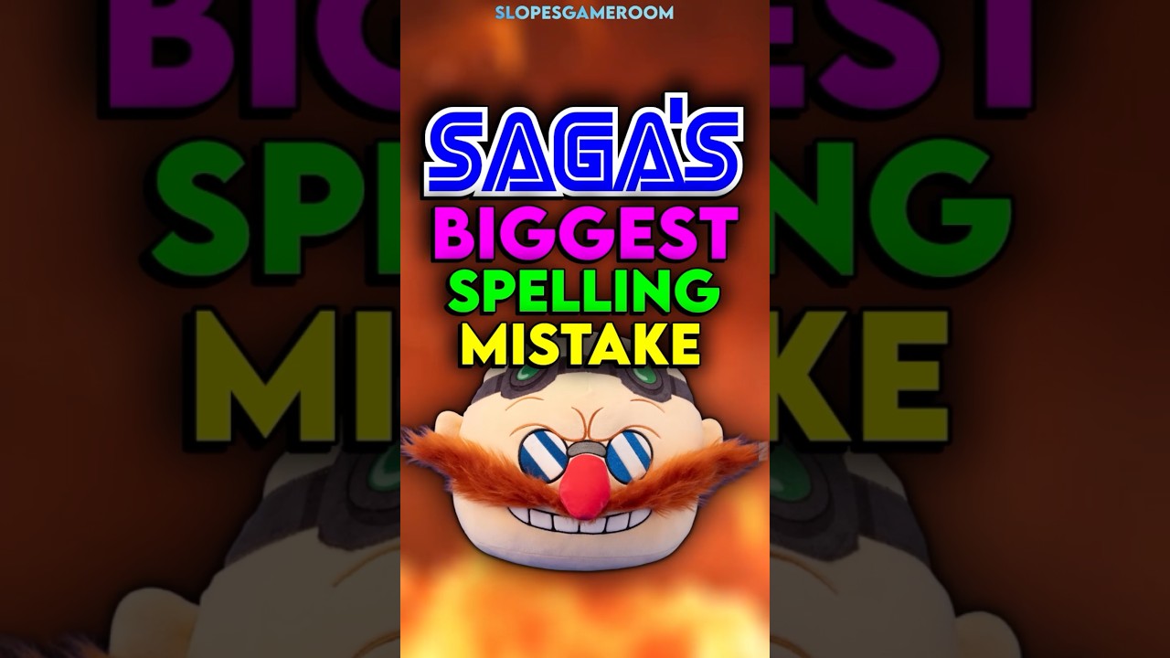
Speaking of Sega logos, social media is remembering fondly the time when Sega bizarrely chose to deliberately misspell the name of its own game Dr. Robotnik’s Mean Bean Machine to allow the game’s logo to fit on the screen in the Game Gear port.
For more inspiration, see our guide to the best gaming logos.


