Over his career, Yo Moriyama has mainly been known for producing concept artwork and prop designs for shows such as Bubble and Lupin the Third: Goemon’s Blood Spray, but he has also been developing a reputation for crafting character designs. That was the skill set he required for the Netflix anime series Sakamoto Days.
Based on the manga created by Yuto Suzuki, the adaptation is animated by TMS Entertainment and directed by Masaki Watanabe. The story revolves around a notorious assassin who falls in love, swears never to kill again, raises a family, and physically gets out of shape. However, the only retirement allowed by the organisation he used to work for is death itself.
“Designing the main character in the way I did for Sakamoto Days is probably my first time doing anything like that!” Moriyama tell us. “I have done more of the character concepts for projects outside of ones I’ve directed myself, but designing characters that actually come to life in an animation like this was a first time for me.”
We caught up with the artist, who was officially credited as the show’s character designer, to learn more. If you’re starting out in concept art of animation yourself, see our guides to the best drawing tablets and the best animation software.
Study of the Manga
Moriyama was initially unfamiliar with the source material for the Netlfix anime. “I actually hadn’t read it until I got the offer to work on this project,” he tells us. As a result, the original character designs from the manga were always a point of reference.
“When I got the offer to work on the project and started, the manga was still at around 10 volumes or so and was gradually transitioning from the comical side to being a little more serious,” Moriyama adds. “I talked with the director about the balance between the two styles to match the action.
The characters are one of the aspects that’s most loved about Sakamoto Days, so Moriyama wanted to retain their look and feel in the animation. Meanwhile, director Watanabe made few special requests. “He allowed me the freedom for the designs,” says Moriyama. “For individual characters, of course there was some advice and we discussed as we went, and made adjustments here and there too.”
Daily design news, reviews, how-tos and more, as picked by the editors.
Thanks to Suzuki’s manga, there was no additional research needed. “I studied that a lot,” says Moriyama. “There’s a lot of information in the original work beyond the characters I designed, such as the way the lines are drawn or other characters that aren’t as important. These things also became references when I was working on the character designs.
“I also studied the way the shadows are drawn. Since it’s a manga, the drawings are quite different from when it was first serialised and now. At this point, I feel that it has more realistic shadow on the characters’ faces, so that was something we incorporated. Usually shadows on faces are simply a tone darker, but in Sakamoto Days there are lines in the shadows as well, which makes it more realistic and stand out. These were the things we wanted to reference.”
Sticking close to the manga, the character designs saw few alterations, as Moriyama explains: “We didn’t bring in too many extra characteristics that would differentiate the characters from the original manga, but we absolutely did retain the features that were unique to the character.”
Designing Taro Sakamoto
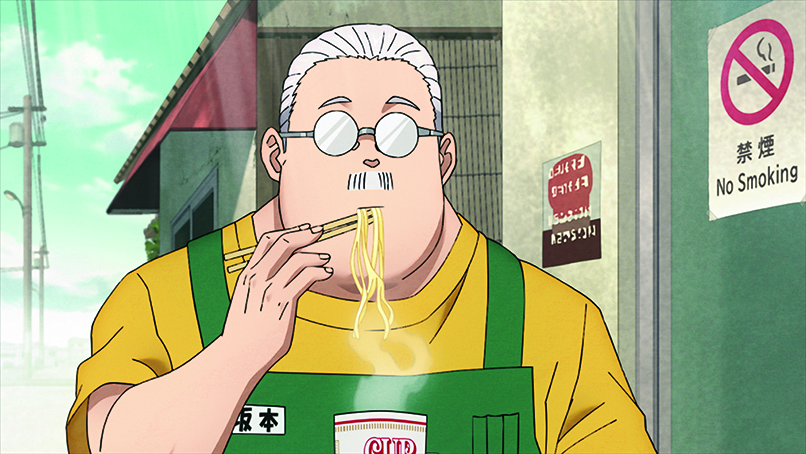
The design of family figurehead Taro Sakamoto was quite different from the other characters. “We kept in mind that his presence itself makes things entertaining,” says Moriyama. “But if we made his design too simple it would stand out from the rest, so we tried to balance it well against the serious side. The lines of the original manga have a very nuanced touch to them, so we were always thinking about how best to transition that across to the anime.”
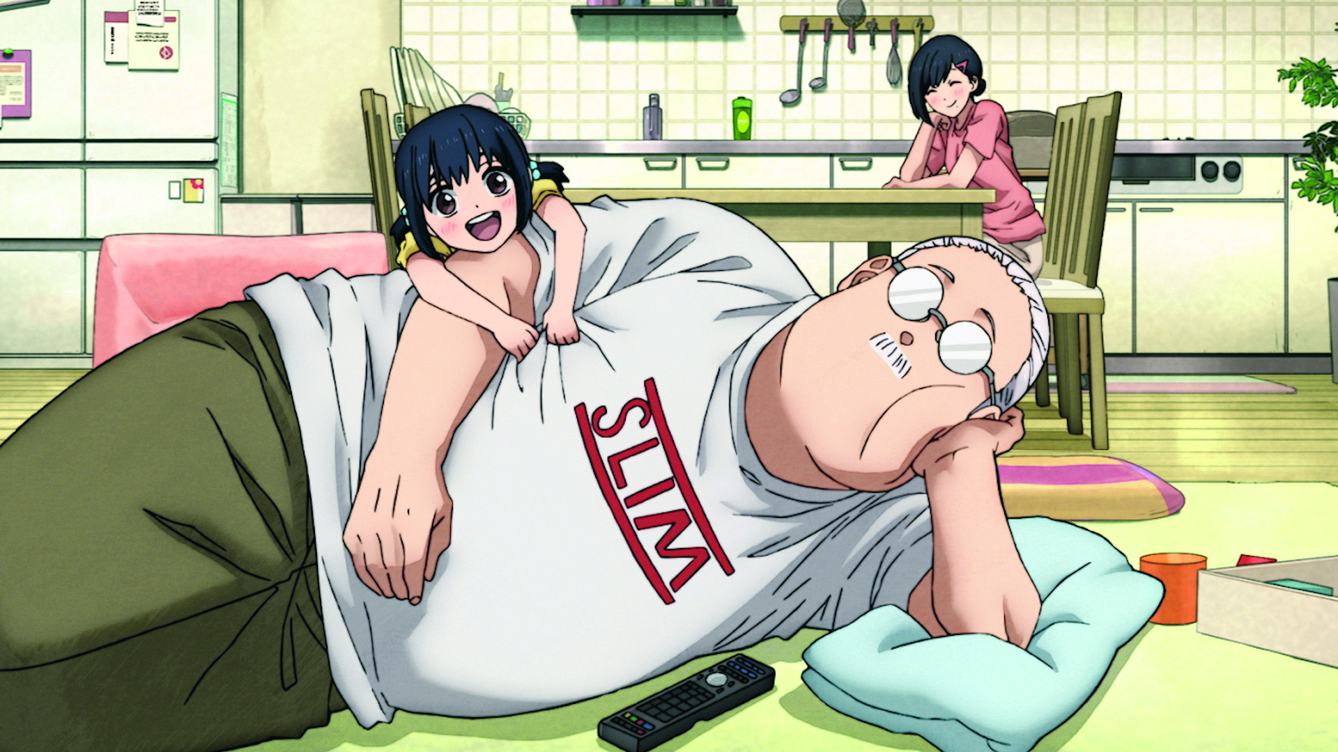
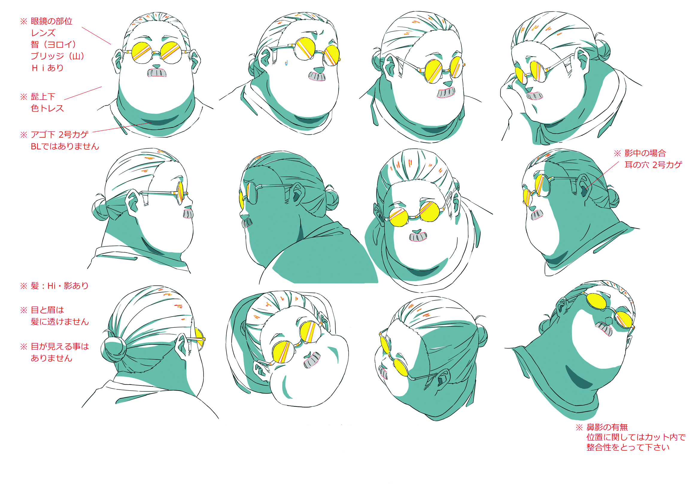
The older, fatter Taro has been given a more muscular look for the animated rendition. “We discussed closely with the director about how to make Taro look fat,” Moriyama adds. “We tried to make him bigger, thicker and heavier compared to the original manga. We wanted to make his form look as though a muscular person had become fat, rather than him just being a fat person. For the chubbiness of his face, that was made possible through animation and making it funny as it moves.”
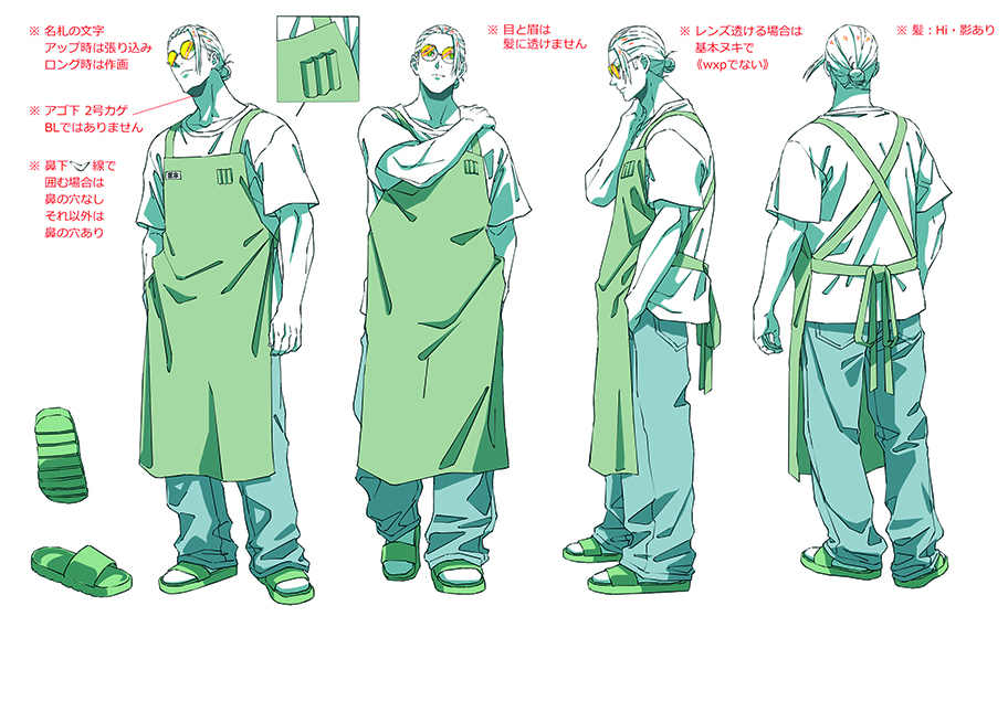
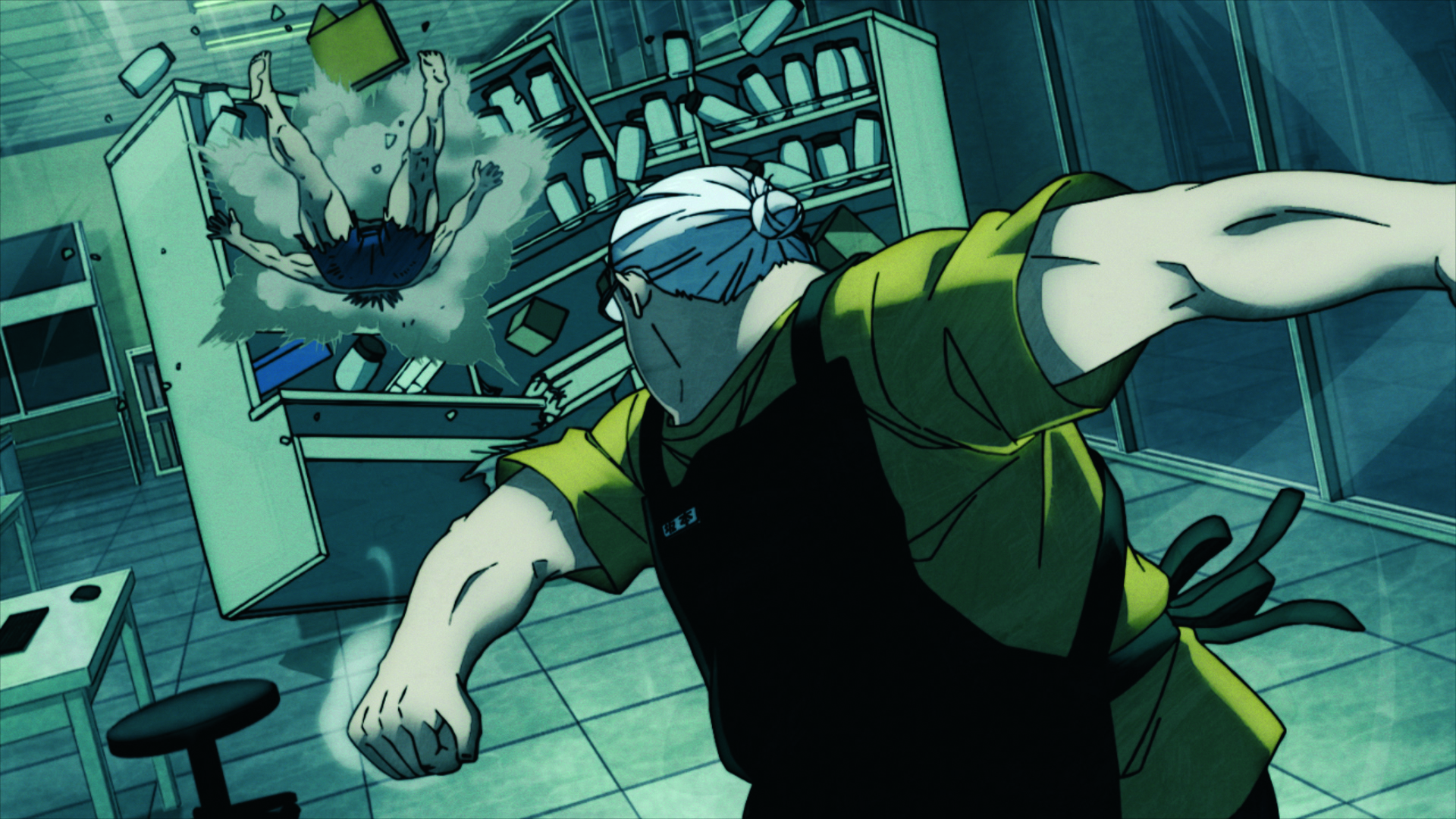
A clever creative decision by Yuto Suzuki was to have the slim form of Taro not only appear in flashbacks, but to use the weight loss as a means to emphasise how much effort and energy he puts into fighting, much like his cinematic inspirations John Wick and Robert McCall of The Equalizer.
One could argue the slimmer Taro Sakamoto is the character’s true form, which has been overtaken by his desire to raise a family. This explains why an exaggerated, cartoony teddy bear aesthetic was adopted for the patriarch’s fat persona and a more realistic stylisation for the slimmed-down version of Taro.
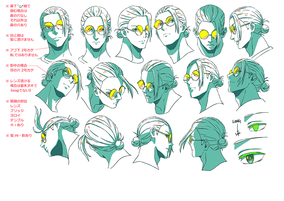
A signature accessory for Taro, for example, is his glasses. “We tried to make his form realistic, but making his glasses super simple or his moustache comic-like, the intentional inconsistency is one of his features that we kept in mind. That’s a very catchy aspect of Taro’s look.”
Conceptualising a prop isn’t significantly different from designing a character. “It depends on whether what I’m designing already exists or doesn’t exist, whether it might be characters or props,” Moriyama observes. “I’ve previously worked on character design, but most of it would be original work where I’d design the character from scratch.
“Working on a project that’s based on an original manga was a relatively new experience for me; the process is totally different. When I work on an original project, I don’t think too much about it and start drawing, then I’ll arrange it from there. But for Sakamoto Days, the characters already existed, so I had to organise their characteristics in my head before I began the drawing process.”
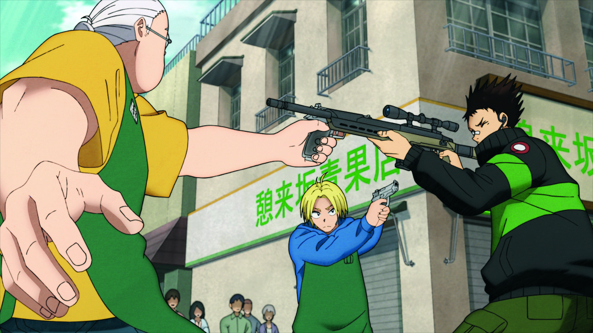
A major supporting cast member went through the most iterations. “Compared to the other characters, Nagumo was a more difficult character to capture the characteristics of,” Moriyama reflects. “I would draw rough drafts of the characters and have Suzuki-sensei review it. For Nagumo, we had a couple of back-and-forth feedback sessions before finalising. On the other hand, Shin and the fat Taro both went smoothly.”
As for his personal favourite character, Moriyama says: “It’s hard for me to choose just one, but Gaku was a fun character to design,” he smiles. “The designs and the final characters that are actually animated are the same, yet they’re also totally different at the same time. “While I did the character design for the series, that design isn’t the final stage.
“From there, we add movement and colours, and it becomes the final product. In that sense, I look forward to people seeing Takamura; he’s a quieter character, and in the manga you don’t actually see his action sequences too much – it’s too quick. I think his action sequences should be appealing in the anime so I look forward to people seeing him.”
Moriyama felt it was an interesting experience having to deal with the established expectations that come with working on an existing IP for the first time. “That was challenging for me,” he says. “When the characters already exist they’ll have their fans, and we need to translate them across to the anime well. As much as it’s challenging, that’s also the creative and fun part of it.”
For more inspiration, see our character design tips and Disney’s 12 principles of animation. We also have a pick of the best anime.


