


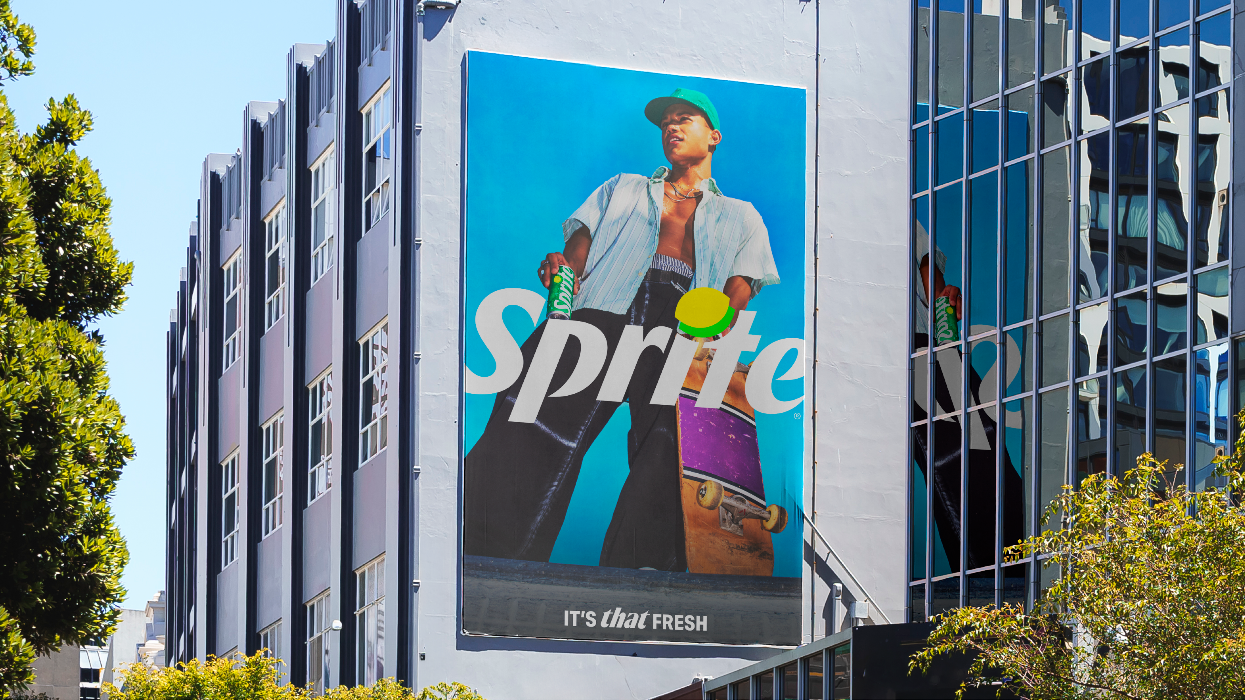
What do you think of when you think of Sprite? Today the world’s most popular lemon and lime drink is launching a new brand identity, with the tagline ‘It’s That Fresh’, which draws on what The Coca-Cola Company says is Sprite’s association with music, basketball and street style.
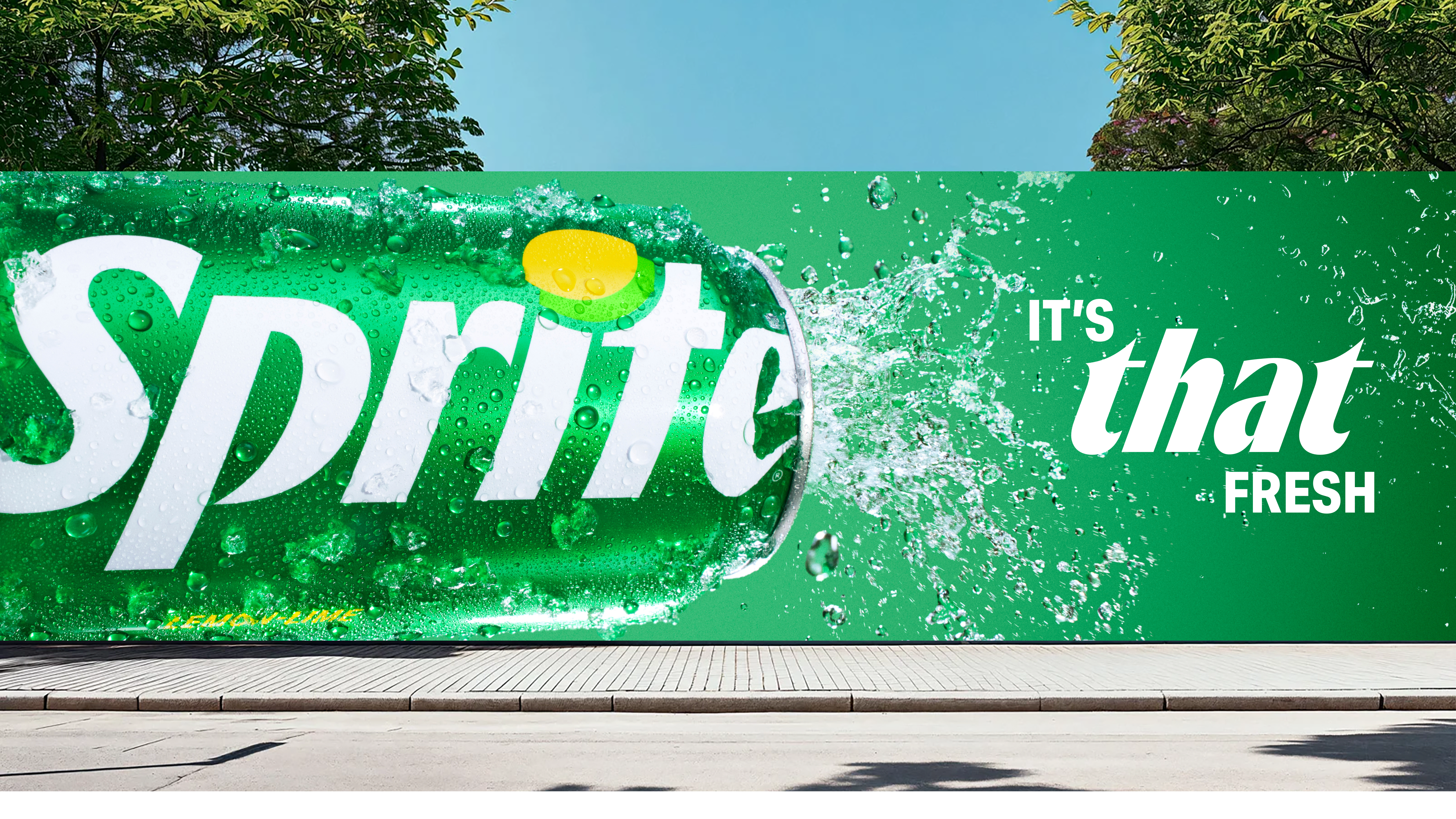
The new look is a return to Sprite’s Lymon symbol, an asset strongly associated with the brand. Of course, it’s had a makeover, and is now one with the Sprite wordmark, appearing as the dot in the ‘i’.

The colour palette remains the classic Sprite colours of green and white, though contrast and saturation have been amped up, with the aim of making the brand more visible on shelf and across its multiple digital environments.
Article continues below
This is quite a subtle makeover, but will it turn out to be among the best logos or best rebrands of the 2020s?
The wordmark is now going to be vertical on cans, while packaging has been simplified, allowing that Lymon to stand out beautifully on the shelf.
As well as the new look, created with studio forpeople, there’s also the introduction of a sonic identity, the Sprite Sound (below). It’s designed to feel as refreshing as the first sip of a cold Sprite and was created in collaboration with producer and artist Mustard.
UK rapper LeoStayTrill has also created original music for Sprite, using the custom, limited-edition Sprite instrument (I know, right? What other brands can say they have a custom instrument?), the Ableton Move (below). This instrument has been pre-loaded with samples and product sounds that make up the new Sprite Sound.
Doubling down on its commitment to street culture, Sprite is also partnering with Crenshaw Skate Club, the Los Angeles–born skate collective known for its influence across skateboarding, fashion and community.

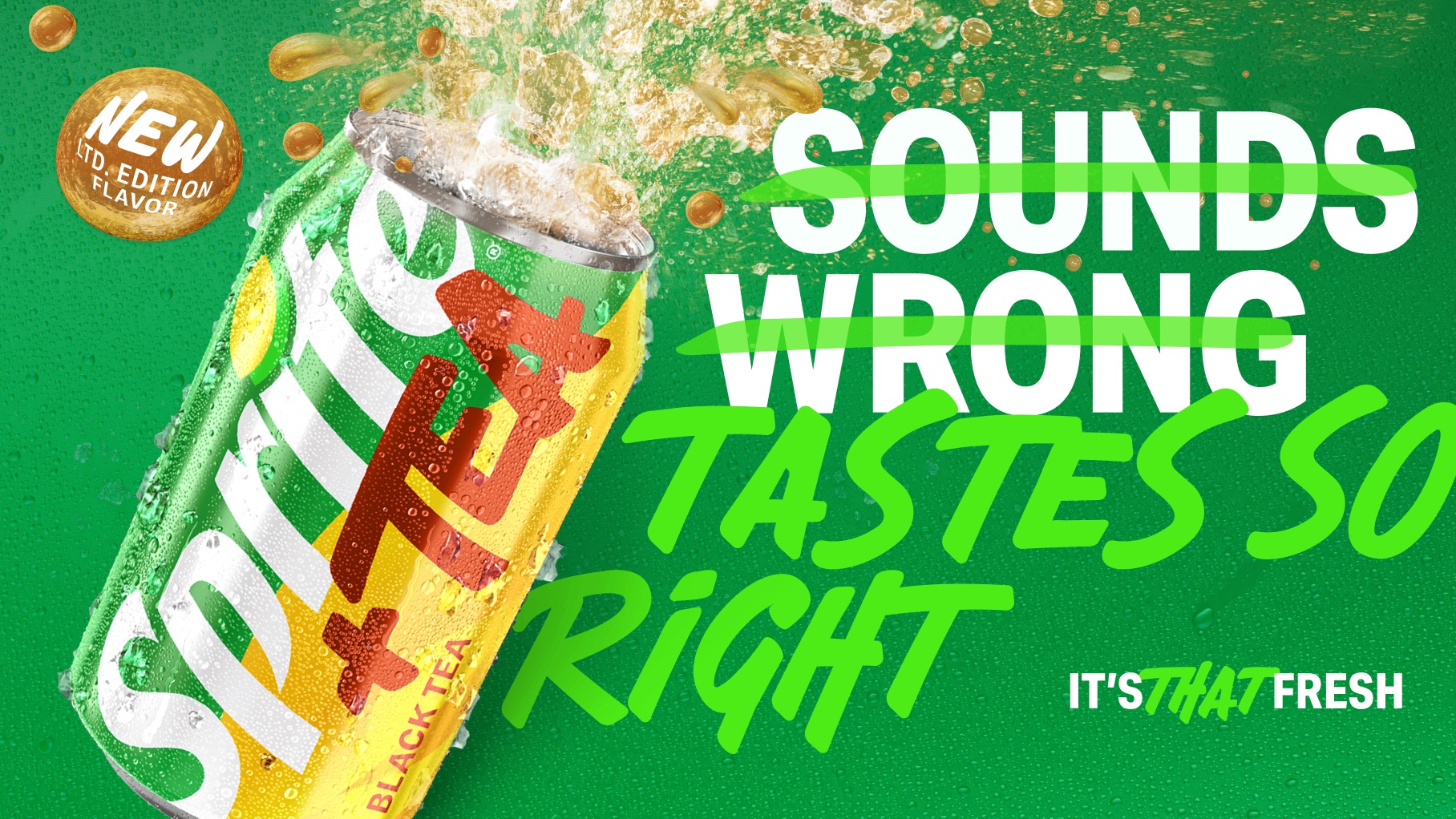
Elsewhere, it’s partnering with Takis, Tabasco and McDonald’s and launching two “innovations” – Sprite Chilli and Sprite + Tea, with the introduction of new flavours Cherry Lime, Strawberry Kiwi, Berry, and Lemon Mint of Sprite Chilli. Sprite + Black Tea will be available in selected markets with more flavours in development.
Image 1 of 3
The new look will begin rolling out from now and will appear across Sprite and Sprite Zero Sugar – with Sprite Zero Sugar having black colour cues to denote its difference.


